Microsoft Graph Toolkit is one of my favorite component which really makes development easy. In the previous article – Using Microsoft Graph Toolkit In SPFx Solution we have seen introduction to MGT and how we can use it in SPFx solution (< SPFx v1.12.1). And in this article we go further and see how we can customize default layouts or styles provided by MGT component based on your business need.
In this article, I was using SPFx v 1.12.1 and the packages – @microsoft/mgt-react, @microsoft/mgt. One of the advantage of using SPFx v1.12.1 is, we no need to make any changes to make MGT workable. Because with 1.12.1 version it comes with updated rush-complier and other stuff which will make MGT package workable. So, we directly jump into the code without any change in the configuration part. The whole code is available in github.
For this article, I took Agenda MGT component and here you can see the sample from MGT playground. And I would like to change the default look and feel of Agenda component and put some custom components.
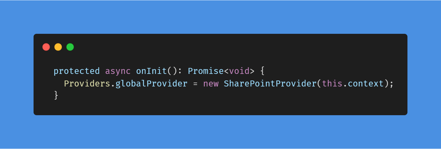
Step 1: Adding global provider in webpart base class component.

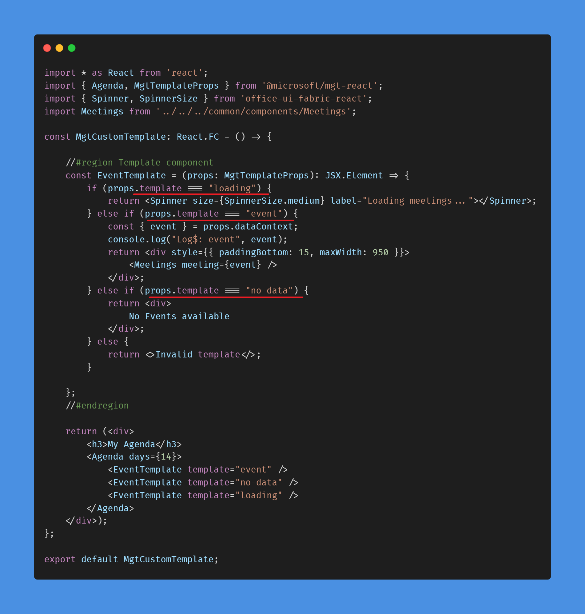
Step 2: Wrap custom component (template for Agenda) inside MGT Agenda component, as shown below. Important thing to notice here is the props we pass to the custom component “loading, event, no-data” which will be used to load right component based on the response from Agenda.

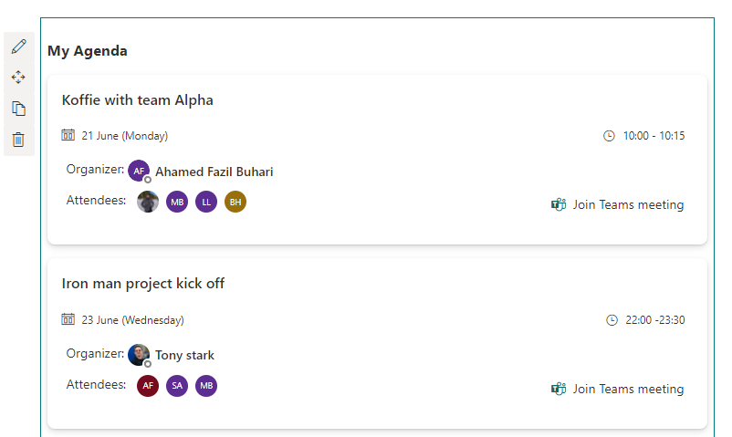
Well, I have designed separate component to render event data which is available here and the output will look like below,

The whole code is available in github
Happy Coding
Fazil

Leave a comment